OK, so the headline is a little tongue in cheek.
But, if I were a larger corporation, I probably would have sent a press release talking about all the major changes I made with my site. And how it’s now more full-functional and high-powered than ever before! Oh, and did I tell you about my flash page? 🙂
But, in the end, I decided not do that (add all the bells and whistles, that is). I actually did the opposite of that. I didn’t add any bells and whistles. And I certainly didn’t add a flash page 🙂
Instead, I did my homework and I aimed to make changes that made things easier for you, my readers, and made some tweaks designed to help my business grow.
So, I thought I’d just take a few moments and talk about the changes I made with my blog–and why. Who knows–maybe my thinking will help you down the road:
Less about me–more about you
My old site had a running list of accolades and me-me-me highlights running down the right-hand side of the site. Initially, I did that because I thought I needed to build my credibility. I needed to enhance my “personal brand.” But, that’s not how you build trust and credibility. You build trust and credibility by doing great work–time and time again. You build trust and credibility by providing value–week in and week out. You don’t do it by talking about how many times you’ve been quoted in the media. So, I took all that stuff off the home page. And made the site, in general, much more about the content (you) and less about me. Sure, I need a few pages that are devoted to me and what I offer clients (this is my online home base for my business, after all). But, it’s far less me-centered than it was yesterday.
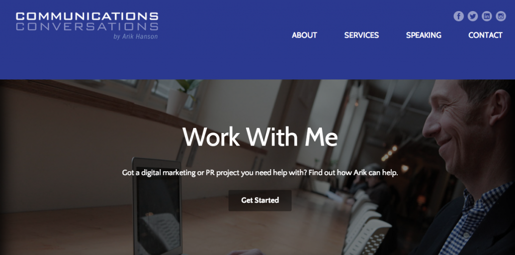
More mobile-friendly
Twenty percent of the folks who visit my site do so on a mobile device. And that number is going to go up, most likely, in the months and years ahead. Since I was using a theme from 2009, my previous site was not mobile-friendly. I knew that had to change. So, I switched to a responsive them (everyone’s doing it, Arik!). I also simplified the hell out of my site. I stripped away all the bells and whistles. All the extra logos and artwork are gone (read: faster load times). And with this particular theme, the left-side column with the text is much wider and easier to read. From a mobile device, my site should be much easier to consume now.
Focus on the “lead funnel”
A couple years ago, I started toying with an e-newsletter to “merchandise” my content a bit more. The aim: To keep friends, colleagues and people like me abreast of what’s happening in the PR and digital marketing industries. Basically what I was trying to do was this: “Here’s what you need to know from the week that was in our industry.” Two years later, that e-newsletter (Talking Points–subscribe here!) is almost up to 1,000 subscribers. But, I haven’t done the best job of encouraging subscribers on my blog/site. So, I’m focusing a bit more on that.
Simplify. Simplify. Simplify.
Instead of adding pages and content–I subtracted and consolidated. I changed the top navigation on my site to be more intuitive and easier to scan with one-word titles (“contact”, “speaking”, etc.). And, I mercilessly cut all those logos and pieces of art down the right-hand side of my blog that were slowing load times. Even though all those logos were nice to see (and good for my ego!), I always knew they were more about me–and less about you. So, off they went! Ba-bye!
I won’t presume to bore you any more than I already have. But, I did want to share my thought process behind some of the changes.
I’d love to hear your feedback–what do you think of the new site? Pros/cons? What do you like/dislike?

0 Comments